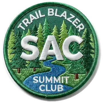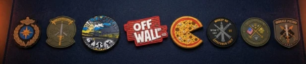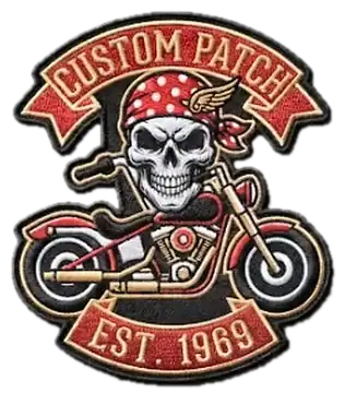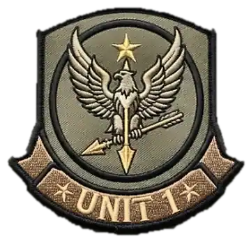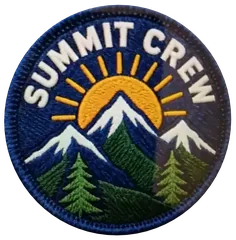
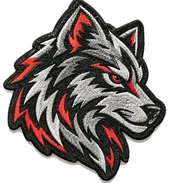
The biggest difference between a patch that looks crisp and one that looks muddy is line weight — thin lines under about 1mm tend to blur once stitched or molded.
Keep your color count reasonable. Two to six colors reproduce cleanly; large photographic gradients are better suited to printed patches than embroidery.
Text is the first thing to suffer at small sizes. If lettering is central to the design, consider a woven or printed finish instead of embroidery.
When you're not sure, send us the raw idea — our design team will flag any of this before production and send a free proof either way.
Choose the technique for your design
- Lots of fine text or thin lines: woven patches keep small details crisp.
- Photos and gradients: printed patches have no color limit.
- Bold logos and crests: embroidered or PVC patches.
- A raised, dimensional look on caps: 3D puff embroidery.
Pick colors you can match
Our reference charts show sizes, the closest Pantone matches, and fabric and thread colors, so you can tell us exactly which shades you want.
What to send us
A finished logo is great, but a sketch, a rough photo or just a description is enough. On the Customize page you can upload PNG, JPG, WebP or SVG files (up to 3 MB) and preview the patch on a cap, T-shirt, jacket or backpack. Our team turns whatever you send into a production-ready file.
Check the proof
Every order gets a free digital proof. Look closely at small text, thin lines and colors, ask for any changes you want, and approve it only when you are happy. Nothing goes into production before that, and you can change or cancel at no cost until you approve.
Quick design checklist
- Lines no thinner than about 1mm.
- Two to six colors for embroidery and PVC; use printed patches for photos and gradients.
- Short, bold text, especially on small patches.
- A size chosen for where the patch goes (see our size and placement guide).
- A backing chosen for how it will be worn (see how to choose a patch backing).